Have questions about this article? Come post them on the forum!
You ask, “What is a color-managed workflow?”. Let’s start by using a very simple example that I know everyone of you have experienced in your lifetime at one time or another. You certainly have walked into one of those big box electronic superstores that sell every TV from various brands in every size that you can imagine. And you have probably said to yourself “I really like that TV, the colors are much more vibrant than that other one!”. The reality is that, that really shouldn’t be the case… they should all show the same flower in the same vibrant color as the next TV. It’s simply that they have been adjusted to show the colors in a different fashion (more or less saturation, more or less contrast, etc.).
So we want you to have the same when it comes to your photography. Regardless of the monitor that you use, or the printer that you print, your photos from them should all look the same. In fact, the printed photo should look the same as your photo on your monitor. YES… it is possible.
This is where a good color-managed workflow comes in. Let’s get started. Firstly, we want our monitor to display colors in a consistent manner at all times. We want the greens to show green, yellows as yellow, etc. We also want the photos on our monitor to look like those that come from our printer and vice versa. So we need to calibrate our monitor. There are several packages available to do this.
iOne Photo Pro – www. xritephoto.com
Colormunki – www.colormunki.com
Spyder3 – spyder.datacolor.com
And many other options available. Simply google (or Microsoft might like you to Bing) “Monitor Color Calibration” and you’ll find many articles and solutions available.
When doing your calibration there are some specific settings that it will ask you for. The typical monitor calibration would be:
Luminance – 90 to 120 cd/m2
Whitepoint – 6500K
Gamma – 2.2
If you need further help with your particular monitor, simply google “color calibration” and your monitor name and you’ll likely find some solutions for your specific case.
Now, if you are using an LCD monitor (most of us are these days) you will likely find that your monitor appears dimmer after the color calibration process is completed than before you started. Yes, this will happen but your eyes will adjust to the new settings. My son often comes into my office and comments that the monitor looks yellow but the real test is when you hold a piece of white paper up next to the monitor they should look the same. If you have accomplished this you are well on your way to a color-managed workflow.
Ok, so now we have accomplished monitor calibration. Where do we go from here you ask?
While you may have a color-calibrated monitor you need to follow some very specific steps to get the same results coming out of your printer. I use Epson printers, so for our example that is what I will demonstrate. You should know that while the screen captures below will be different for different printers the concepts are the same.
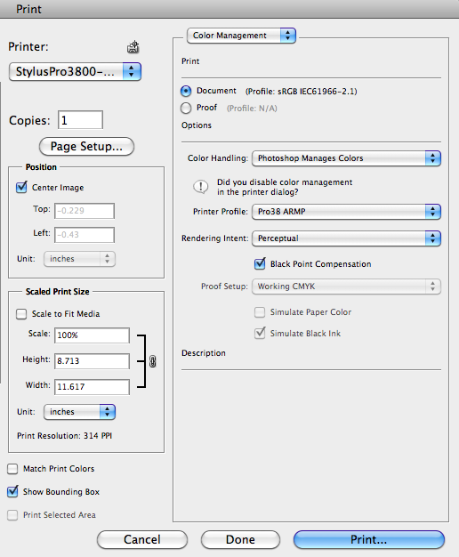
So let’s assume you have your photo ready to print. There are other factors to consider but we’ll discuss those at another time. What you need to understand now is that your monitor is properly calibrated, and now we will pick a color profile for your printer. In this step, when we hit the Print button, we want our application (in my case either Photoshop or Lightroom) to perform all the color management. We DO NOT want the printer to do any color management for us, we simply want it to process the instructions sent to it by the application.
So there are two critical steps:
- Tell the printer driver NOT to perform any color management.
- Tell the application which color profile to use when sending the print job to the printer driver, thus performing the necessary color management.
Let’s walk through each of these steps for Lightroom and Photoshop.
Lightroom Print Settings:
With your photo selected for printing go to the Print Module. ![]()
You will then find the Print Settings button on the bottom left of this window. ![]()
Here is where you will tell the Printer Driver NOT to perform any color management and your paper selection.
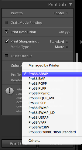
Finally, the last step is to tell the application to apply a printer profile when sending the print job to the printer driver. You will notice a selection called “Managed by Printer” You DO NOT want to select this option but rather the printer profile specific to your printer and paper. In my case I am using (for this example only) an Epson 3800 printer with Archival Matte Paper, therefore I will use the “Pro3800 ARMP” printer profile.
If you fail to turn off color management at the printer driver you will essentially be performing color management TWICE and likely will not get a print that matches the colors displayed on your monitor.
Now hit PRINT and voila you should achieve a color managed print matching your monitor! 🙂
Photoshop Print Settings:
Hit the Print button and you will now tell the print driver NOT to perform any color management and select your paper type.
Now hit PRINT and voila you should achieve a color managed print matching your monitor! 🙂
Selecting Printer Profiles:
All paper manufacturers profile printer profiles for the most common printers available. Those companies that provide both a printer an paper (Epson, Canon, HP) will generally install the profiles for their own papers.
If you use papers from manufacturers other than your printer manufacturer you will either have to download the profiles from the paper manufacturer or create a custom printer profile for that specific paper (a topic for another day).
Summary
Unfortunately, we don’t live in an age of click the shutter and print the photo but if you understand the process necessary and what is happening you too will get fine color-managed photos. Take time to understand and you will achieve excellent results.


Comment